Fonts are Tools.
Yet it is believed that there is no specific, industry standard that guides the application of font sizes and styles. However, it is imperative to know that the decision is largely dependent on the font foundry (or creator). Depending on the type of designs that is being worked on, which could be a flier, banner, website, blogpost, thumbnail, etc., the designer retains the prerogative of which font style to use. That means, it is the choice of the designer to work with their preferred font style.
There is a general rule of thumb in ant type of design. The general aesthetics, clarity and readability of a text is important when choosing the font style,size and type of any font. Whether on Websites, for presentation, print material or any other design context, the legibility of any font style must be previewed to ascertain their legibility, because no one builds a website for example to have an increased bounce rate. In the same way, no one designs a print material only to have every font look awkward and fails to communicate the intended message or promotion.
Why (or the Psychology) Behind The Font Styles in Design.
1. Font reveals personality:
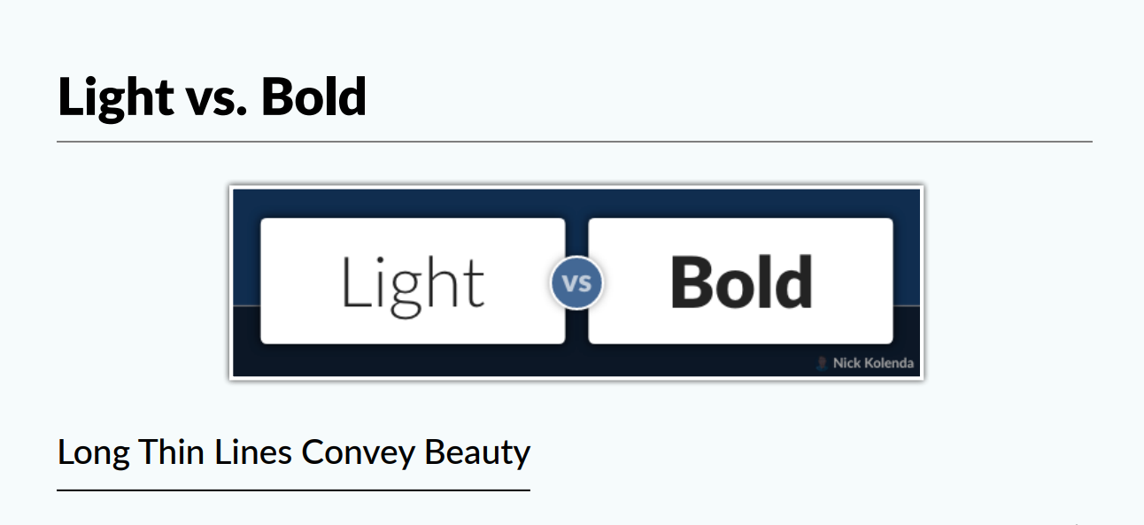
Research by psychologists according to nickkolenda has revealed that fonts largely communicate the emotions or the message-identity of a person. Typefaces that are lighter in weight (in width and stroke thickness) are seen as delicate, gentle, and feminine, while heavier typefaces are strong, aggressive, and masculine. (Brumberger, 2003, p. 208).
Here is a typical example. A Large number of concepts on beauty are “Being Tall and Thin”. Many Fashion homes have deployed this to sell more. And this is reflected on their product designs.
One example of such fashion is AVON.

This ‘Tall and Thin’ signals Beauty to the brain. In sum, seeing the logo for Avon activates beauty. Since this business sells beauty products, this congruence feels good — and people misattribute these positive emotions to the font and business. The font simply “feels right.”
Conversely, Fraktur Font is attributed to negative emotion-Nazi Propaganda.

The word “Fraktur” derives from Latin frāctūra (“a break”), built from frāctus, passive participle of frangere (“to break”), the same root as the English word “fracture”.
Fraktur was often characterized as “the German typeface” because it remained popular in Germany and Eastern Europe for a longer time than elsewhere.
2. For Distinct Brand Identity:
One major reason for deploying different styles in a particular design is to curate a unique brand identity. Consistency in any business model brings about being an authority in the field. Therefore, by electing a font that aligns with the brand’s personality, values, and target audience, companies can reinforce their visual identity and differentiate themselves from competitors. Certain fonts are also good for logo creation, and for some reasons the company or designer may retain the same font style for subsequent/future designs.
Examples of Brands or companies with distinct identity using unique font styles are:
- Gucci
- Dior
- Prada
- Armani
- Tiffany & Co.
- Diaroogle.com
- Good
- Etc…
3. The Aesthetics Of The Design
Largely, the average designer is careful with the selection of font styles and sizes because of the look and beauty that comes with their design. Many will agree that font styles and attractiveness plays a major role in converting more clients. Except from industries like the print publishing houses, e-library and e-stores such as Amazon, ebook publishers that are keen on using “Times New Roman” as the industry standard, other designers are at liberty to employ the font style that communicate their messages.
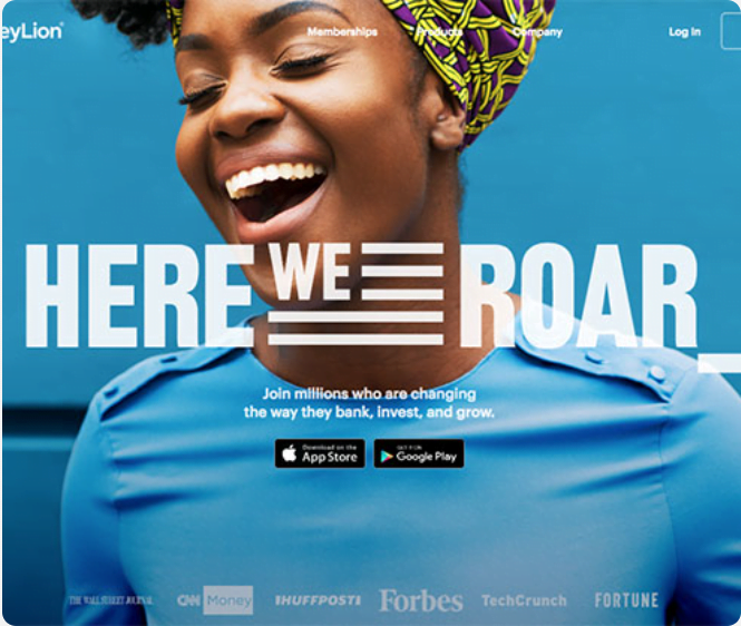
In the Image above, the designer employed a font style that is elegant and thick font style to have a compelling design.

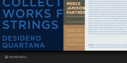
In the above image, We could see the designer deploy a variation of different font styles to reveal their design prowess.
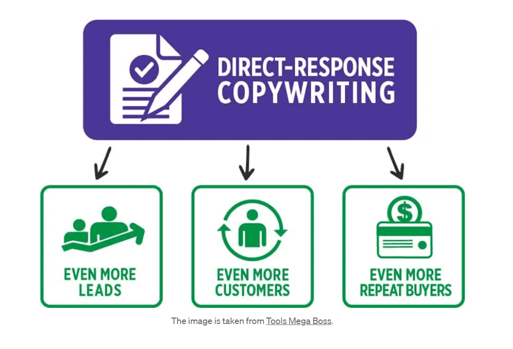
4. Sales Conversion
For scripting sales copy, designers over the years would rather create a compelling promotion flier to increase clicks which would in turn result in more sales or income. For example, the image below reveals that the sales copy is likely to endear a client for a transaction because the designer has been able to come up with an endearing and befitting font. Digital marketer, among other things, also give preference to designs that convert potential leads to sales. The design converts simply because its messages and contents are clear, thus giving room for an action to be engaged.
Using a clear and legible font can help customers quickly understand the message being conveyed, while using a bold or italicized font can draw attention to key points or calls to action.
5. Accessibility
Many websites have increased bounce rate because at a visitor’s landing on the home page the fonts are not readable. Some visitors are visually impaired or have reading difficulties, thus they repel any content with non-legible contents. Selecting fonts that are accessible, with appropriate size, spacing, and contrast, ensures that everyone can access and understand the information.
Types of Font Styles
There are different Font Styles but not Limited to;
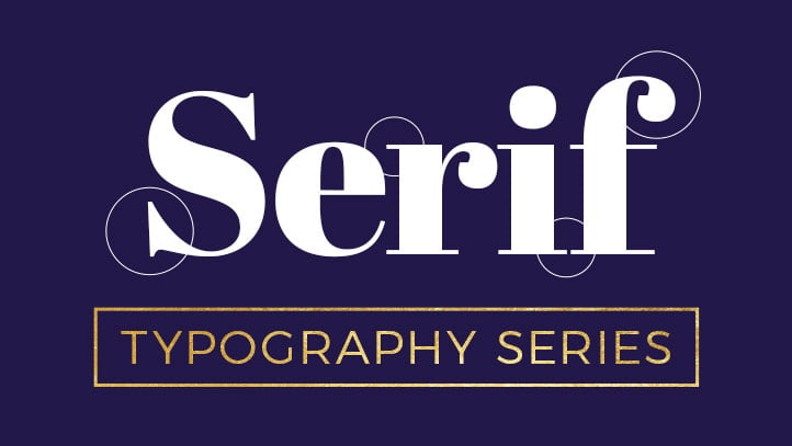
1. Serif font:
The word ‘serif’ refers to the small feet present at the tops and bottoms of each letter. These tiny flourishes stemmed from artists’ brushes and would be added to the letters as decorative elements.These have small lines or flourishes at the ends of their characters. Though ancient, the classic Serif has survived centuries in the world of design. Due to its popularity it has mutated to a more stylish and luxurious version known as the modern serif.
Examples of Popular Serif fonts are:
- Times New RomanWhat makes Times New Roman more than just a popular choice among those who are unfamiliar with typography? Times New Roman’s primary purpose is print readability. This can be paired with a number of fonts like Gotham, Lucida Grande, Source Sans Pro, etc.
- GeorgiaGeorgia – The main point of Georgia is its legibility on low resolution screens vs printing. It is more streamlined for use on screens, and it has become popular for its legibility and elegant appearance.
- RingiftThis is a modern typeface used widely for classic restaurants, typography, menu design, Logos, quotes, posters, branding, business cards, blog headers, postcards, movie titles, greeting cards,art quotes, magazines and more.
- BileBile is a lesser-known font that is commonly used in designing Fashion Magazine covers. It often features in editorials, lifestyle tips, interviews and visual contents showcasing the latest fashion trends. It is a font that communicates elegance and beauty.
- CambriaJelle Bosma, a Dutch typeface designer, created a font in 2004 for the ClearType Font Collection of Windows Vista. The font was designed to achieve the same goal as Georgia but for LCD screens. Cambria is often used in various applications, including documents, presentations, and websites, where a sophisticated and readable serif font is desired.
- Geramond
- Palatino
- Bodoni
- Baskerville
- Kinta
- Mafins
- Reatrain
2. Sans-serif fonts
According to Google fonts, A sans serif—or simply “sans”—is a typeface designed without serifs (from “sans”, the French word for “without”). Typically, sans serif faces have lower stroke contrast and larger x-heights than serifs.
In Typography, serifs are small, often associated with minimalist looks that is there are no extension at the end of a longer stroke, as against that of the regular serifs. Sans serif fonts come in various styles, including geometric sans serifs such as Futura, humanist sans serifs like Frutiger, grotesque sans serifs like Franklin Gothic, and neo-grotesque sans serifs like Helvetica. All these can be used in branding of applications, digital prints, logos and branding as a whole. Examples of notable Brands that use sans serifs are Calvin Klein, LinkedIn, and The Guardian.

Example of Sans Serif Fonts Are
Gotham
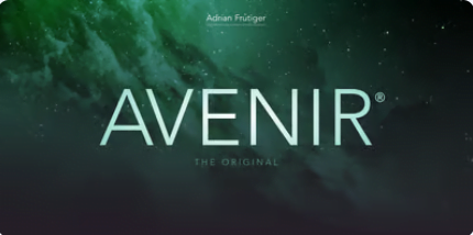
Avenir
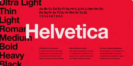
Helvetica
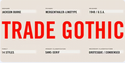
Trade Gothic
Din Next

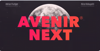
Avenir Next
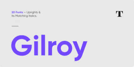
Gilroy
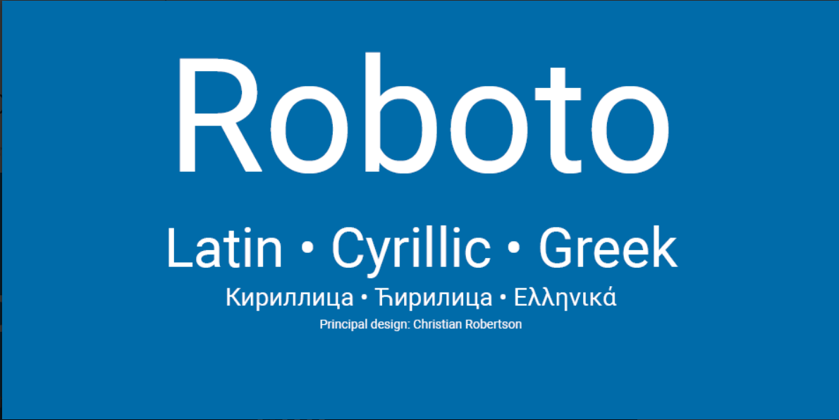
Roboto
Others include Open Sans, Poppins, Noto Sans, work Sans, Epilogue.
3. Script fonts
Which mimic handwriting or calligraphy and they are used for decorative purposes. These sets of fonts have a traditional, elegant look which makes it adapt more to an informal, casual or playful feel. These are used majorly for designs outside the formal patterns. Where there are few formal script fonts and can together be deployed for Artistic designs, invitations, greeting cards, logos etc
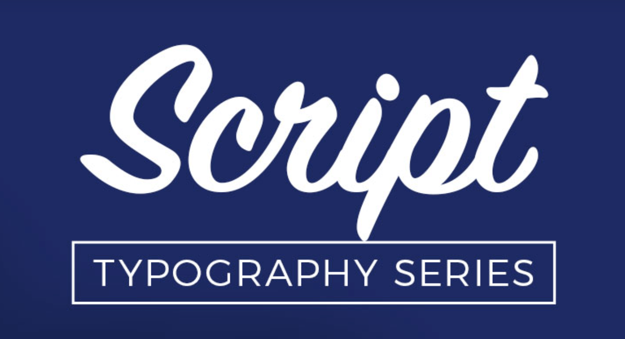
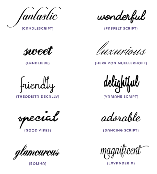
Here are more examples of Script Fonts.
- Brush Script
- Bickham Script
- Edwardian Script
- Candlescript
- Landliebe
- Theodista Decally
- Good vibes
- Dancing Script
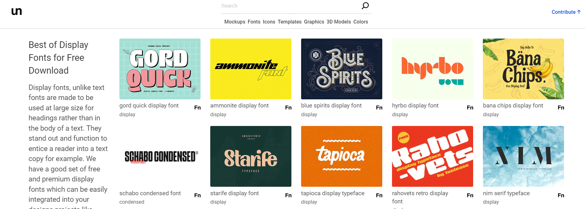
4. Display Font
As the name implies, these are a set of fonts used in the design of Headlines, Title texts and are intended to grab the visitors’ attention, hence their large font sizes. Display fonts come in different styles, which could either be serif, san serif, script or decorative.They are often useful in advertising, branding and packaging either, print or digital materials. Examples of notable display fonts are, Boboni, impact etc.
Unblast is a good library to access display fonts.